I’ve been working on a food-mapping project for the past several months called Food: An Atlas. The project is a non-profit venture launched by the CAGE (Cartography and GIS Education) Lab at the University of California at Berkeley. The project team intends to self-publish a map created by a network of content providers and cartographers over the web. The idea behind the project is to produce a food atlas in a short amount of time from a broad community of researchers. The Berkeley team, located in the Geography Department, received over 80 map submissions from 10 states in the U.S., South America, and Europe.
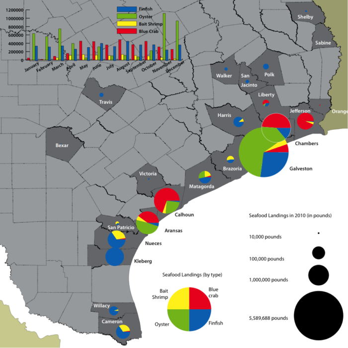
Content providers, like myself, provided map data; the project team provided me a cartographer, who happened to be the talented Jeff Ingebritson, a graduate student from the Geography Department at the University of Wisconsin. Together we hashed through my data and his GIS program to create a map of seafood provisioning in Texas.
This was so much fun and an incredibly cool platform. And, I learned what most data mappers already know: You look for data first, then map it. At first, I wanted our map to show how seafood enters Austin, Texas only to find that there is no data for that story. So, I used existing databases and found ways to tell a different story.
The CAGE team plans to publish the atlas online, funded by support acquired through a Kickstarter campaign. See here to add your support HERE.
Author